Animation Library
Add animation classes to content you'd like to animate.
Fade-in content animation
The fade-in class added to the <h2> and <p> elements will fade-in the elements when users scroll to it.
Slide-in content animations
Slide-in classes will slide-in the elements when users scroll to it. Elements can slide in from either left, right, top or bottom. The animation can either be more pronounced (i.e. slide-left-offscreen) or more subtle (i.e. slide-left-subtle).
Slide Left Offscreen
Use the class: slide-left-offscreen
Slide Right Offscreen
Use the class: slide-right-offscreen
Slide Top Offscreen
Use the class: slide-top-offscreen
Slide Bottom Offscreen
Use the class: slide-bottom-offscreen
Slide Left Subtle
Use the class: slide-left-subtle
Slide Right Subtle
Use the class: slide-right-subtle
Slide Top Subtle
Use the class: slide-top-subtle
Slide Bottom Subtle
Use the class: slide-bottom-subtle
Button animations
The following classes can be added to buttons or links styled as buttons to make them more interactive.
- change-bg-color: changes the background color of a button on hover
- slide-bg-color: slides in a new background color on hover
- pulse-hover: slightly increases the size of a button on hover
- click-shadow: an inset shadow is added to a button when clicked
- hover-glow: button has halo-like glow on hover
- rounded-bg-slide: slides in a new background color on hover for rounded buttons
- parallel-outlines: background color of a button turns transparent and outlines get added to the top and bottom
- outline: background color turns transparent and outline is added
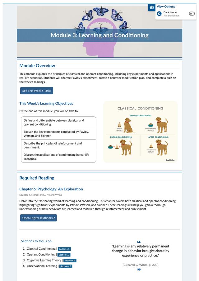
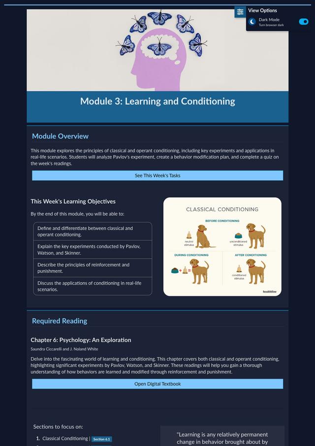
View Options
Quickly offer view option features by adding just a single attribute to your <body> element
Dark Mode
Use view-options or dark-mode to add the dark mode view option to your course shell. This gives students the option to toggle on a dark mode version of the webpage.